One mountain, entirely.
How Adi Kailash Explore looks, speaks and behaves — the standard behind adikailash.io. Written for the people who build with us: our team, our partners, the press, and the next designer.
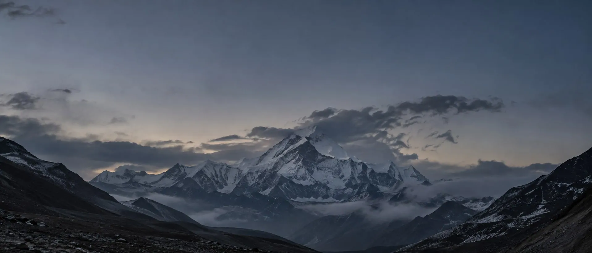
The Kailash you can reach.
Mount Kailash needs a visa, a permit, a lottery and another country's consent. Adi Kailash stands inside India — the same pyramid, the same lake at its foot — at the end of a road from Pithoragarh.
The brand exists to make that reach real. The permit filed before you arrive. A driver who has driven the gorge all season. A certified guide. A room that matches its photograph. A price that is the price. Everything we make — a page, a message, a card, a vehicle — should shorten the distance between wanting to stand there and standing there.
That is why the name is the place and the verb is Explore. Not “yatra”, not “tours”, not “holidays”. The mountain is the brand; exploring is what we do with it, for whoever comes and for whatever reason they come.
 Adi KailashExplore
Run by the valley
People from Pithoragarh and Dharchula, certified by the Tourism & Hospitality Skill Council, on this road every week of the season. Local knowledge is the product — everything else is how we deliver it.
Honest to the metre
A label is a claim. We name only what is true: the photograph is of the place it names, the altitude is measured, the refund line is a contract. Over-promising here is not a marketing risk. It is a guest stranded at 3,200 m.
Fast by design
A page that loads on a hill signal, an enquiry that lands in WhatsApp in one tap, quotes and permits handled by software. The platform does the waiting so people can do the mountain.
One route, owned completely.
Most operators sell all of Uttarakhand, or all of India, an inch deep. We sell one axis — Adi Kailash, Om Parvat, the Darma and Johar valleys, and the road from Kathgodam to Gunji — and we intend to know it better than anyone alive.
For travellers drawn to the high Himalaya — by faith, by stillness, or by the road itself — Adi Kailash Explore is the operator of record for the Adi Kailash route: run from Pithoragarh by people of these valleys, built on a platform that answers in minutes, and honest to the metre about what the mountain asks.
The one axis
The road climbs 698 km from Delhi to the last motorable point at Gunji. Tap any stop to see what is there.

start · 315 km to Kathgodam
- 383 km
- Kathgodam railhead to Gunji, the last motorable point — every metre of it driven, all season
- 3,200 m
- Gunji. Base for both Adi Kailash and Om Parvat, and where the acclimatisation day is spent
- 1 permit
- The Inner Line Permit, filed at SDM Dharchula before a guest arrives — not on the day
- 0 spread
- No Kedarnath, no Auli. Search for the mountain and you find us: the category and the brand are one word
Premium means certainty, not luxury.
- The permit already done
- — before you arrive, not on the day
- A vehicle that does not break
- — at Malpa, in the rain
- A guide who has seen altitude sickness
- — before, and acts
- A room that matches its photograph
- — the one we showed, not one like it
Local vendors know the road and cannot be found.
National aggregators can be found and have never driven it.
The people who drive it, findable — the road and the platform in one company.
Three travellers, one road
The religious
Darshan of the second of the Panch Kailash. Parvati Sarovar, Om Parvat at Nabhidhang, the temple at Kalapani. They come because it is sacred, and we treat it as sacred.
The spiritual
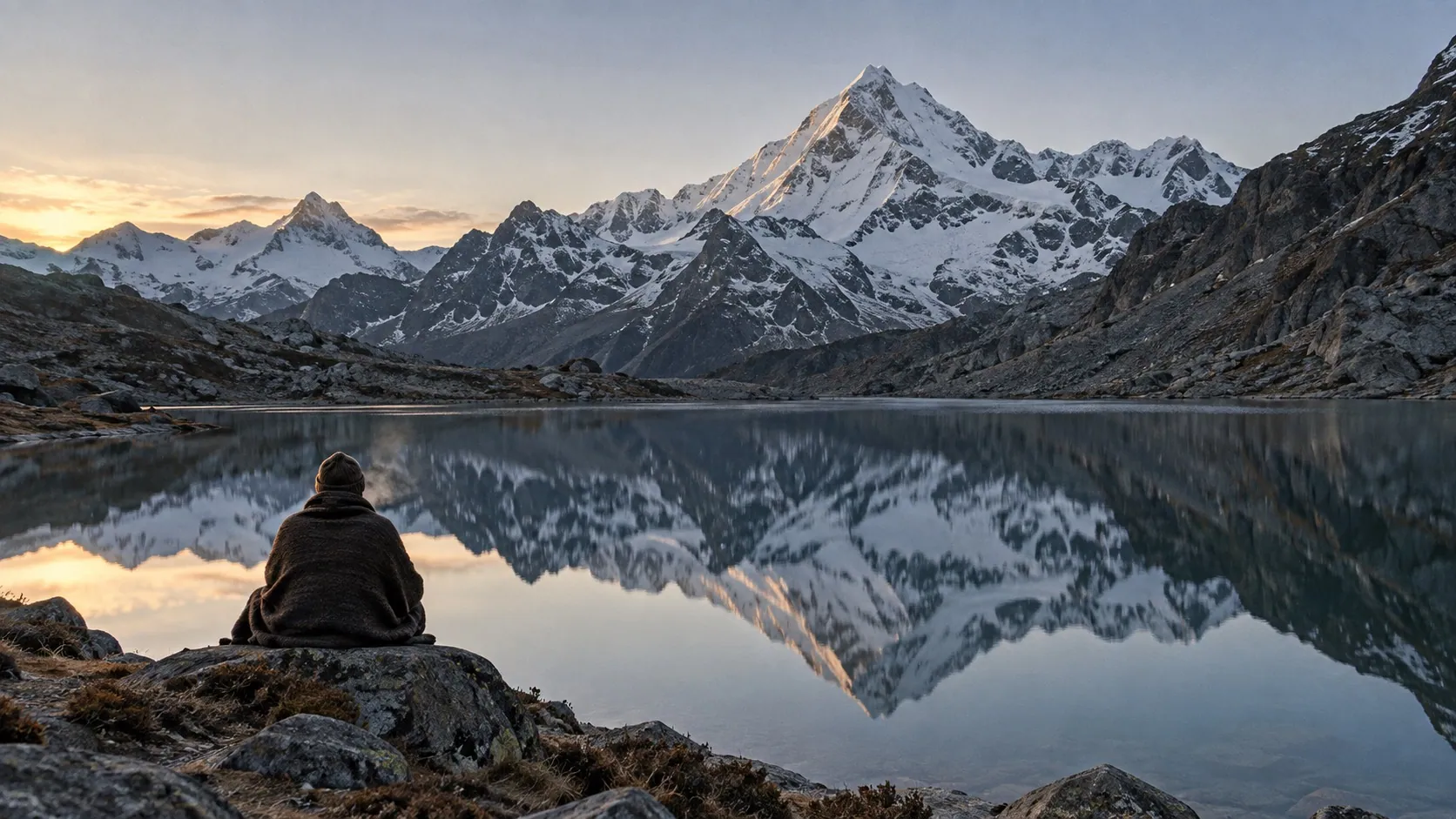
Not a rite, a stillness. The lake at dawn, the valley with nobody in it, a homestay with a Rung family. They come for what the place does to a person.
The adventurous
The road itself: 383 km from the railhead to 3,200 m, the gorge, the Kali, the altitude. Riders, drivers, walkers. They come because it is far and high and real.
The brand must hold all three without alienating any. So the mark and the wordmark carry no religious symbol — the ॐ above pictures a traveller, not the brand — the copy never says “pilgrims” alone — it says travellers — and the welcome is explicit: any faith, any passport, any reason.
Six rules we do not break.
These are not values on a wall. Each one is already enforced somewhere on the site, and each one has cost us a feature we would otherwise have shipped.
- 01
A label is a claim.
Naming a photograph makes it a photograph of that place. Publishing a refund percentage makes it a contract. Publishing a countdown makes it a deadline. We write nothing we cannot stand behind at 3,200 m.
- 02
Show what is real.
Placeholders look like placeholders — stripes where the stay photographs will go, a disabled button instead of a broken one, no reels section rather than an empty one. A visible gap gets filled. A plausible lie ships.
- 03
Measure, then say.
Distances are driven, altitudes are surveyed, layouts are checked in a real browser before they are written down. If we have not measured it, we do not print it.
- 04
The mountain sets the terms.
Altitude, weather, permits and the road decide what is possible. We say what the mountain asks and we do not sell past it. Urgency is real or it is absent: the offer clock is a hard date, and when it lapses it lapses. It never resets itself.
- 05
Everyone's mountain.
The religious, the spiritual and the adventurous, from anywhere. No religious iconography in the identity, no exclusion in the copy, no assumption about why a person has come.
- 06
Fast by default.
Pages in milliseconds, answers in minutes, decisions made easy. Automation for the waiting — quotes, permits, reminders — and people for the road. Speed is respect for the traveller's time.
Adi Kailash Explore. Address: adikailash.io.
Two forms, one brand. The company is written in three words; the address is written as an address.
- In running text
- First mention “Adi Kailash Explore (adikailash.io)”; after that, either. Never both twice in a paragraph.
- The mountain
- “Adi Kailash” alone is the mountain, never the company. “Adi Kailash Explore runs to Adi Kailash” is how we say it.
- Packages
- Destination first, origin second: “Darma Valley from Delhi”. An ampersand pairs; an em dash makes a variant.
- Spoken
- “adi kailash dot i-o”. On the phone we answer as Adi Kailash Explore.
- The platform
- Vyas — the system of record we are building, named for the valley. Internal until it is a product.
- Adi Kailash Explorethe company, as written
- adikailash.iothe address, and the short name
- Adi Kailash & Om Parvata pair takes the ampersand
- AdiKailash Explorethe words are never joined
- Adi Kailash ExplorerExplore is the verb, not a person
- Adi Kailash Tourswe are not a tour company; we are the route
- ADIKAILASH.IOan address is lowercase, always
- AKEnever abbreviated — the name is the place
The peak and the path.
One stroke. It is a mountain before it is anything else, and it is an A for anyone who looks twice. It signs; the name speaks — in any lockup the name is the larger element.

Anatomy
Four features, one stroke. The drawing shows the mark as an outline with its fill greyed, so the features read as parts of a shape rather than a silhouette.
- 1The summitThe pyramid of Adi Kailash, seen from Jolingkong — the stroke rises to one point and no other.
- 2The shoulderThe ridge falling away east in a single unbroken sweep. The stroke never lifts.
- 3The valleyThe notch the ridge shelters — open to the west, the way the real valley opens to the Kali. It never closes into a counter.
- 4The pathThe Kali and its road at the mountain's foot, doubling back on itself the way the road does.
Together they make an A, for Adi, and a mountain that is unmistakably a mountain. It carries no trident, no om, no swastika, by intention. It belongs to everyone who comes.
Construction
Everything is drawn in x— a third of the mark’s height, exactly. The mark stands 3x tall and just under 5x wide; clear space is one x on every side, and nothing enters it — not type, not a partner’s logo, not a photograph’s edge. The circles are the box’s own: inscribed at 1.5x, circumscribed at 2.9x — how far the mark reaches on a round ground, an avatar or a coin.
- The name leads
- The mark never outweighs the name. In a lockup it stands at the cap height of “Adi Kailash” — a signature beside the words, not a monument above them. Big, it appears alone; beside type, it stays small.
- Colour
- Ink on white. White on ink. White on a photograph, only over a veil dark enough to read it. Never any other colour, never a gradient, never an outline.
- Minimum size
- 24 px tall on screen, 8 mm in print. Smaller than that the counter closes; use the wordmark alone.
- Alone or with the name
- The mark stands alone only where the context is unmistakably ours — the favicon, the app icon, a watermark on our own photograph. Everywhere else the wordmark is beside or beneath it.
- Clear space
- One x on every side — x being a third of the mark's height. The construction plate below draws it; nothing enters the dashed line.
- The file
- One SVG, one path. Do not redraw it, trace it, or export it from a screenshot. Take it from the assets below.
Lockups
The mark, in the world
Over our own photographs and nowhere else. Centred and alone when the picture is the statement; signed small from a corner when the picture is the story; ghosted as a watermark when the photograph travels without us.
 Adi KailashExplore
What not to do
The pattern
The mark, half-dropped and faint — the one place it is decoration. Set the repeat, read the tile’s measurements off the plate, take the tile.
- Where
- Wrapping paper, the inside of an envelope, a wall at the office, the back of a document, the lining of the field kit.
- Never
- Behind body text; over a photograph; at more than 12% ink; as a border or a stripe. It is a field, or it is absent.
- How
- Always the half-drop; the mark whole, never cropped by the tile; ink on wash or ivory, ivory on ink. The tile is taken from here, not redrawn.
Two faces, one hand.
Satoshi is the voice: every heading, every paragraph, every button. Inter Display is the shout: the hero word, the big numerals, the posters. There is no third.
The wordmark
Two weights on one line: Adi Kailash at 700, Explore at 400, both on Satoshi’s tight display tracking. The difference in weight says the place is the brand and Explore is what we do with it. It is typed, never drawn: the header sets it live, and so should every document.
Weight and tracking
500 for every heading and every button. 700 for the wordmark and nothing else. 400 for reading. Body copy is never bold; a figure that needs to stand out is set at 550. Tracking is the signature — −0.06em at display sizes, easing to −0.03em in body — and it is what makes the page read expensive without a single decoration.
Numbers and units
- Prices
- ₹24,600 / person · Indian grouping: ₹1,20,000
- Duration
- 5 days · 4 nights — the middot is the separator
- Distance & height
- ~900 km round trip · 3,200 m · 383 km
- Dates & time left
- 12 Aug 2026 · 3d 14h — never seconds
- Departure
- from Haldwani — lowercase from, the town's name as spelt locally
Colour comes from the mountain.
The system is monochrome. Five greys carry every page; the photographs bring the blue of the sky and the ochre of the valley. Two functional accents mean one thing each. Tap a column to take its hex.
The rules
No brand colour is applied to a surface for decoration. If a layout looks grey, the photograph is wrong, not the palette. Urgent appears once on a screen or not at all. Olive marks a gain. Sky belongs to the hero and the map and does not travel.
Night
The second light. Ivory on near-black, hairlines at 14% white, wash at #161616. It is what a visitor sees when they choose the Premium tier on a tour page, and what this page becomes when you press Night on the cover. It exists because nearly every colour on the site is a token: flip the tokens and the page follows.
Of the place it names.
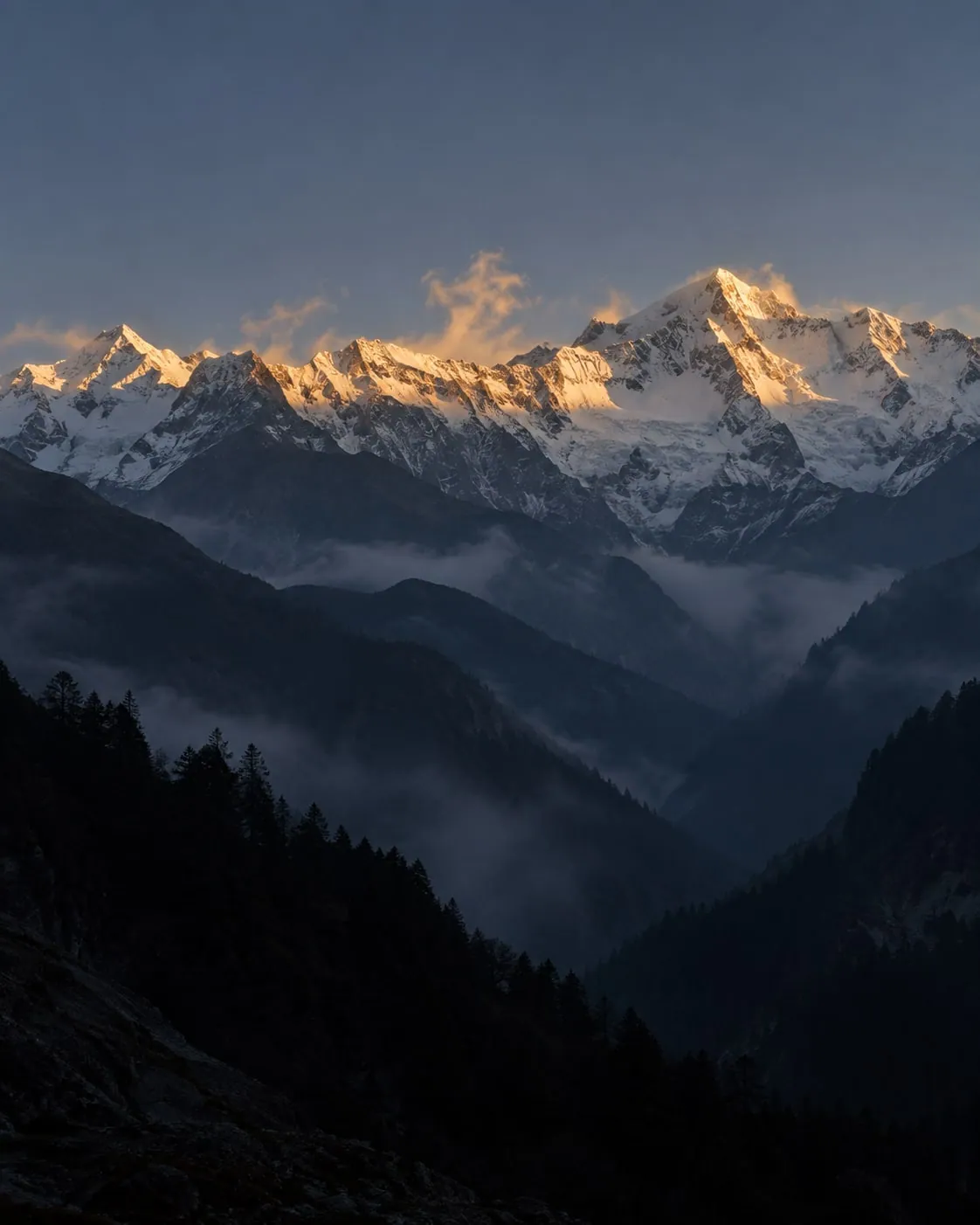
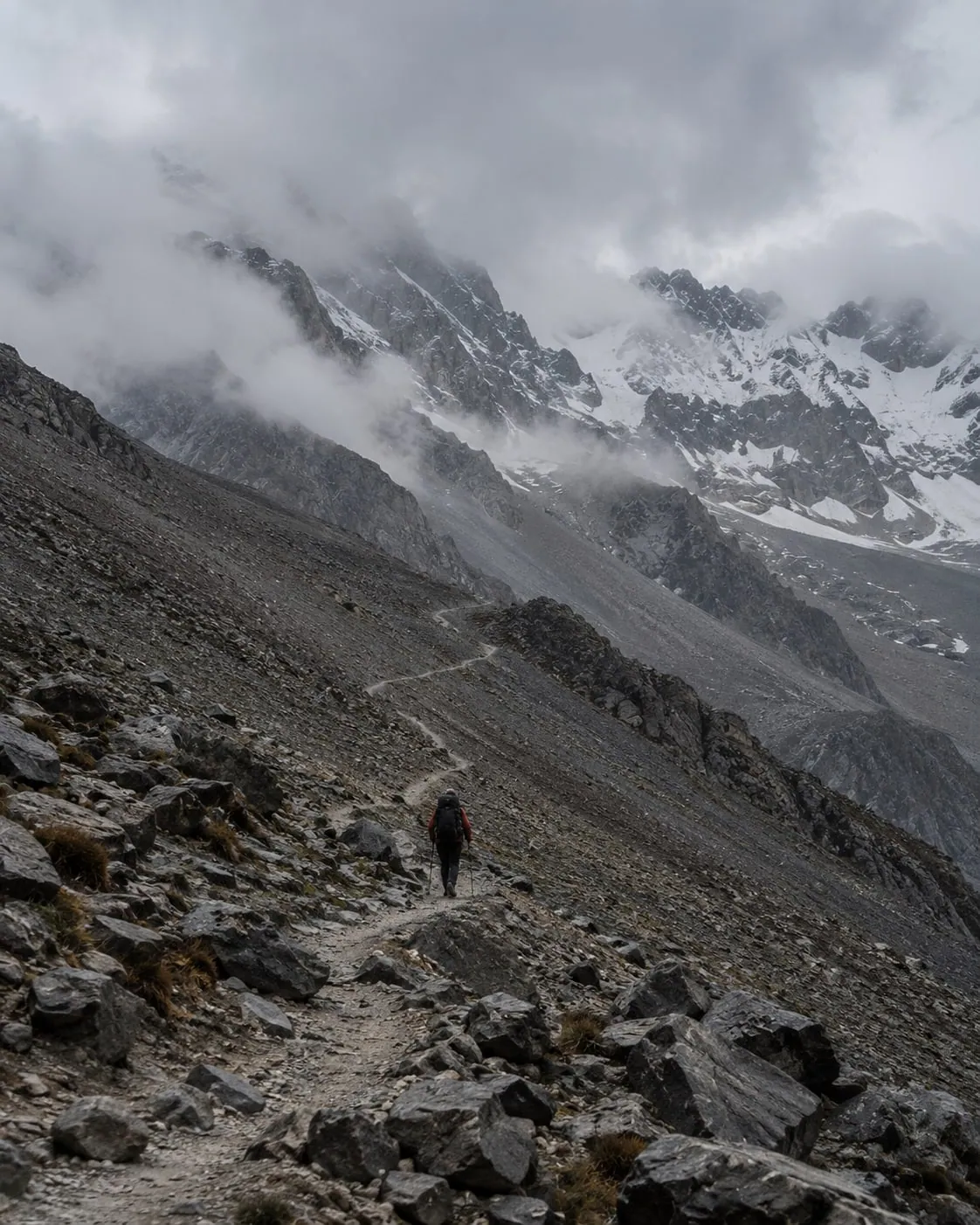
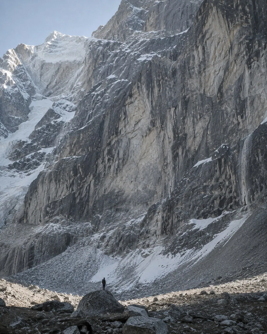
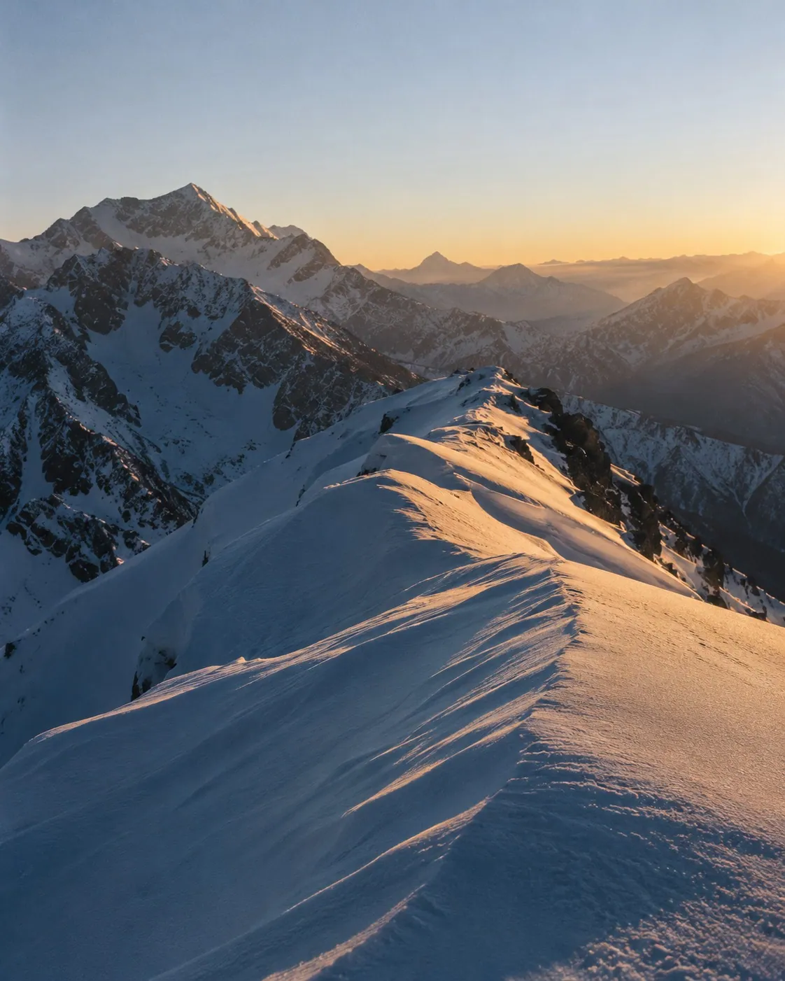
The photographs are the brand's colour, its proof and its promise. Six rules, one frame each — art direction for the photographs we will take, not photographs of named places.
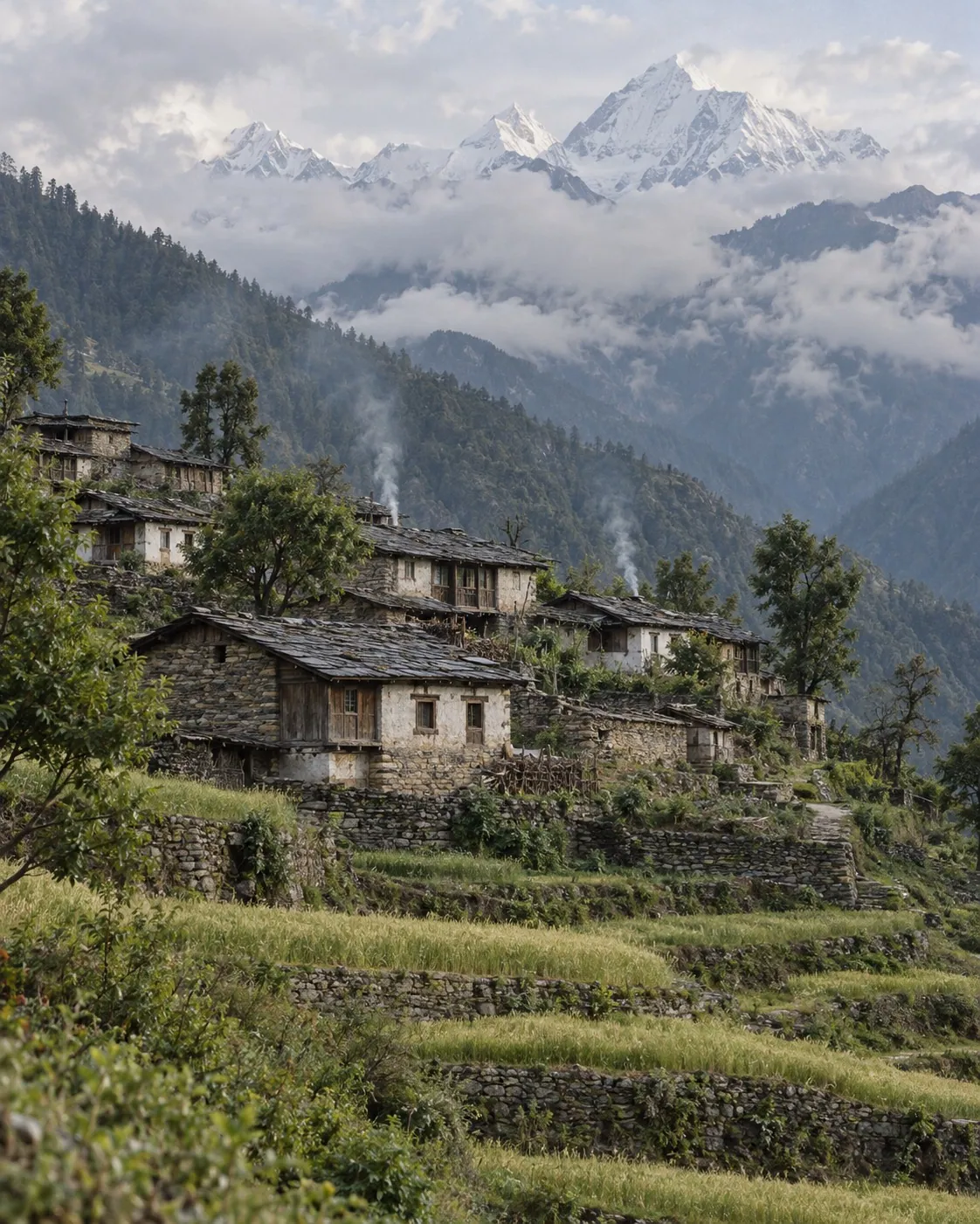
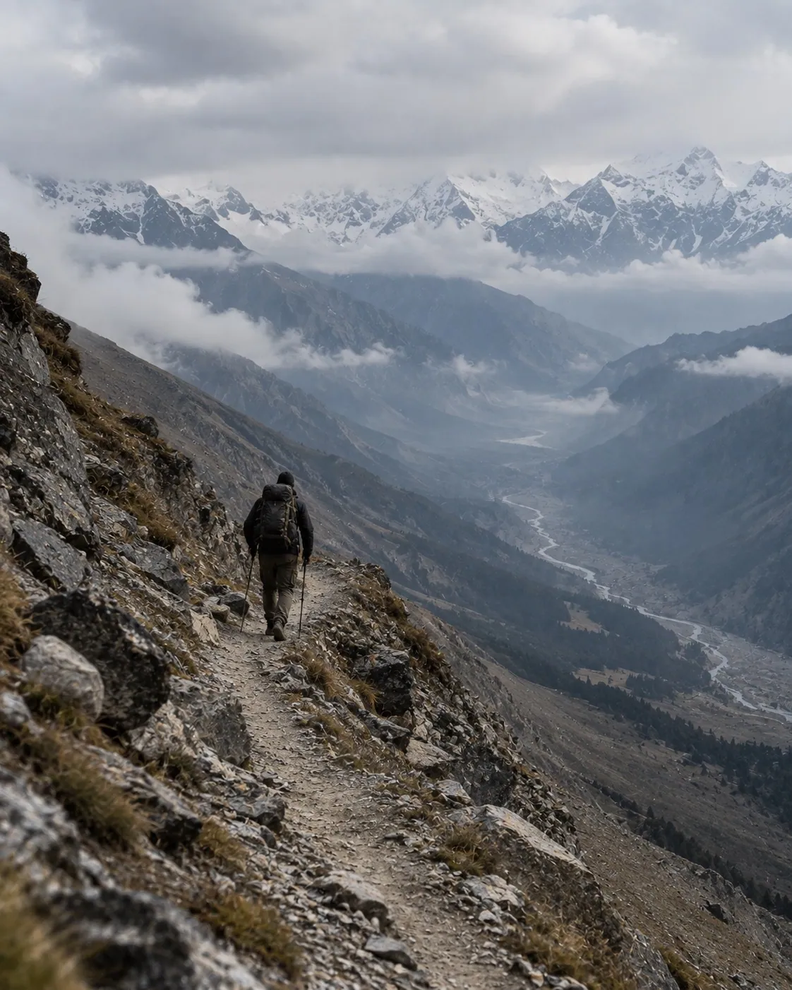
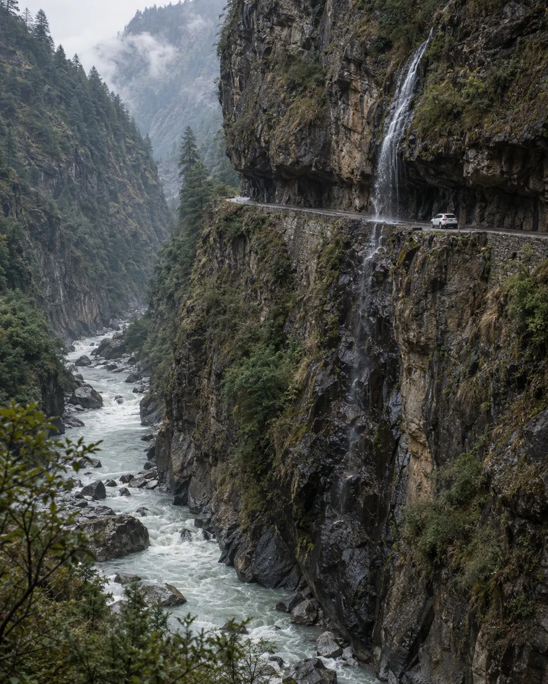
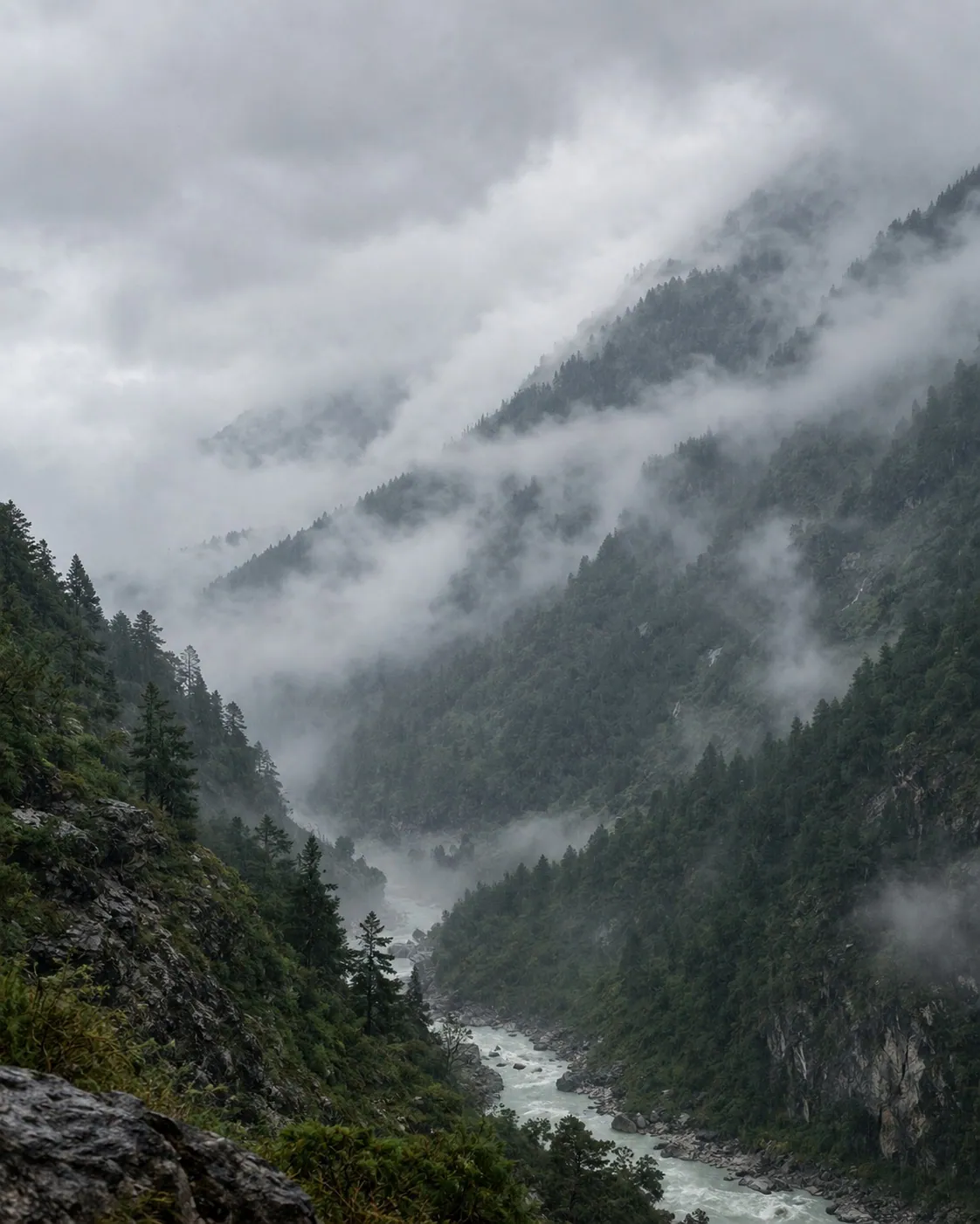
- Real and ours
- No stock. No licences we do not hold. Photographs come from our own departures, our guides, and our guests — a guest's phone photograph at card size is proof, and proof beats polish.
- Named honestly
- A photograph captioned Om Parvat is of Om Parvat. Where a picture is representative of a region rather than of the named stop, it is marked so in the code and replaced the moment a real one arrives.
- People, with consent
- The faces of the valley — the Rung families who host, the guides, the drivers — appear only with written consent, named the way they want to be named, never as scenery.
- Treatment
- No filters, no HDR, no sky replacement. A dark veil is allowed only where type must sit on the picture, and only as dark as the type needs.
- Frames
- 4 : 5 for cards, 16 : 10 for a day of the itinerary, 1200 × 630 for a share card, 9 : 16 for reels. The focal point travels with the image, so a crop never loses the summit.
Plain, exact, warm.
We write the way a good guide talks at the trailhead: short sentences, the number before the adjective, and no promise the road cannot keep.
Specific over superlative
“383 km from the railhead” beats “an unforgettable journey”. If a sentence has an adjective and a figure, keep the figure.
Travellers, not pilgrims
Pilgrims names one of our three travellers. Travellers names all of them. “Yatra” appears when a guest uses it, not as our category.
No exclamation marks
Nothing on the mountain needs one. Urgency is a date, stated once, in red, and honoured.
Namaste first
Every WhatsApp opens with Namaste and the traveller's name. We reply in the language they wrote in.
British spelling
Recognised, travellers, colour, programme. Consistent with the seals and the certificates we cite.
Say what the mountain asks
Altitude, cold, a road that closes in rain. We write these before the price, not in the small print.
Not thisExperience the divine journey of a lifetime!!!
ThisAdi Kailash and Om Parvat both sit inside India — driven, not trekked, with permits, stays and a certified guide arranged.
Not thisHurry! Limited seats! Offer ends soon!
ThisSeason price ends in 3d 14h. (And when it ends, it ends.)
Not thisLuxury 5-star stays throughout
ThisHotels in Pithoragarh. Homestays at altitude — Rung families in Dantu, and a wall of ice in the morning.
Not thisBest Adi Kailash yatra package for pilgrims
ThisFor the religious, the spiritual and the adventurous — one road, three reasons to be on it.
Not this100% safe, guaranteed darshan
ThisThe Gunji road is weather-dependent. We do not charge for days we cannot run.
Things arrive. Nothing nags.
One easing curve, a handful of durations, and a rule about news: it plays once.
- The curve
- cubic-bezier(0.22, 1, 0.36, 1) — a fast start and a long settle. Every transition on the site uses it; nothing bounces except a price that has just changed.
- Arrival
- Content rises 24 px and settles from a soft blur over 900 ms, staggered by 80 ms. It is how this page came in.
- News plays once
- The booking bar announces the saving and the clock one time, the first time it is seen. A thing that replayed on every scroll would stop being news and start being a nag.
- Belts walk
- Marquees move at reading pace, about 25 px a second, and pause under the pointer. They carry captions, never the only copy of anything.
- Clocks do not twitch
- The countdown shows days and hours, or hours and minutes. Never seconds — a premium page does not fidget at its visitor.
- Reduced motion
- Honoured everywhere. The finished state is always a complete state.
The interface grammar
Cards are wash on white with a 24 px radius and no border. Buttons are ink pills; over a photograph they are glass. Pills label; hairlines separate. On a phone the whole page speaks in hairline rows — the batch strip, the facts table, the seals, the map captions — one grammar so a reader never learns a second one.
Claims you can check.
Every mark of trust we show is a registration or a certificate that a stranger can verify. That is the standard, and it is the whole point of showing them.
- Recognised
 Uttarakhand Tourism
- Certified
 MSME, Govt. of India
- Verified
 NIDHI Portal
- Tourism & Hospitality Skill Council — Tour Manager OperationsNCVET · Skill India · NSQF Level 5.5 · verifiable at skillindiadigital.gov.inCertified
How they are shown
Line-work only, at equal height, in ink or in white — never in the issuing body’s colours, which would make our page look like theirs. The claim is made in text beside the mark, and the text is what a reader can check.
Lines we do not cross
No pictorial use of the national emblem or of public figures in commercial material (the Emblems and Names Act, 1950). No recutting of copyrighted film — we embed and credit. No personal details from any certificate are ever published; the claim is stated and the register is named.
Room for a second name.
Motoring and motorcycle expeditions, corporate journeys, hotel partners, and channel partners across India who sell our route as their own. The brand is built to sit beside another without either losing its shape.
- The lockup
- Our lockup, a hairline, the partner's mark at the same cap height. Ours first on our materials; theirs first on theirs. The hairline is the only thing between the two — the partner never enters the mark's clear space and never sits inside it.
- Naming an expedition
- Adi Kailash Explore × Partner — Route. “Adi Kailash Explore × [Partner] — Om Parvat Expedition”. The multiplication sign, spaced, not an x or an ampersand.
- Attribution on a partner's site
- “Operated by Adi Kailash Explore · adikailash.io”, set in the partner's type, linked. Channel partners use our photographs and cards as issued, unedited and captioned as we caption them.
- What partners inherit
- The six principles. A partner who sells this route sells it as we describe it: the altitude stated, the permit explained, the price fixed. What a partner promises, we have to keep at 3,200 m.
The brand you can hold.
The identity leaves the screen: the card handed over at the office, the badge on a guide's jacket, the vehicle that waits at Kathgodam, the app in a traveller's hand. Every slot carries a full design brief as its prompt — copy it, generate, and the finished mockup drops in.
Each prompt carries the identity spec in full — the stroke, the wordmark, ink and ivory — so the mockups come back dressed. A generator’s mark is close, never exact: mockups are art direction, and production artwork comes only from the files in Assets — rule one of the mark still stands where the brand is real. The one slot that stays striped is people: D9 waits for real portraits, with written consent, as the Photography chapter requires.
For the wider site — culture and philosophy
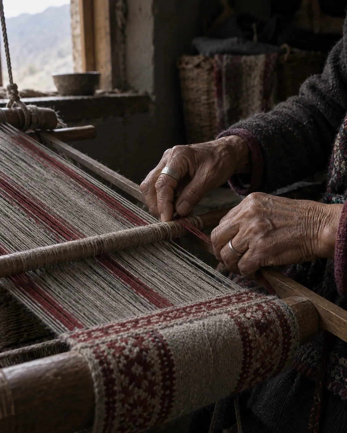
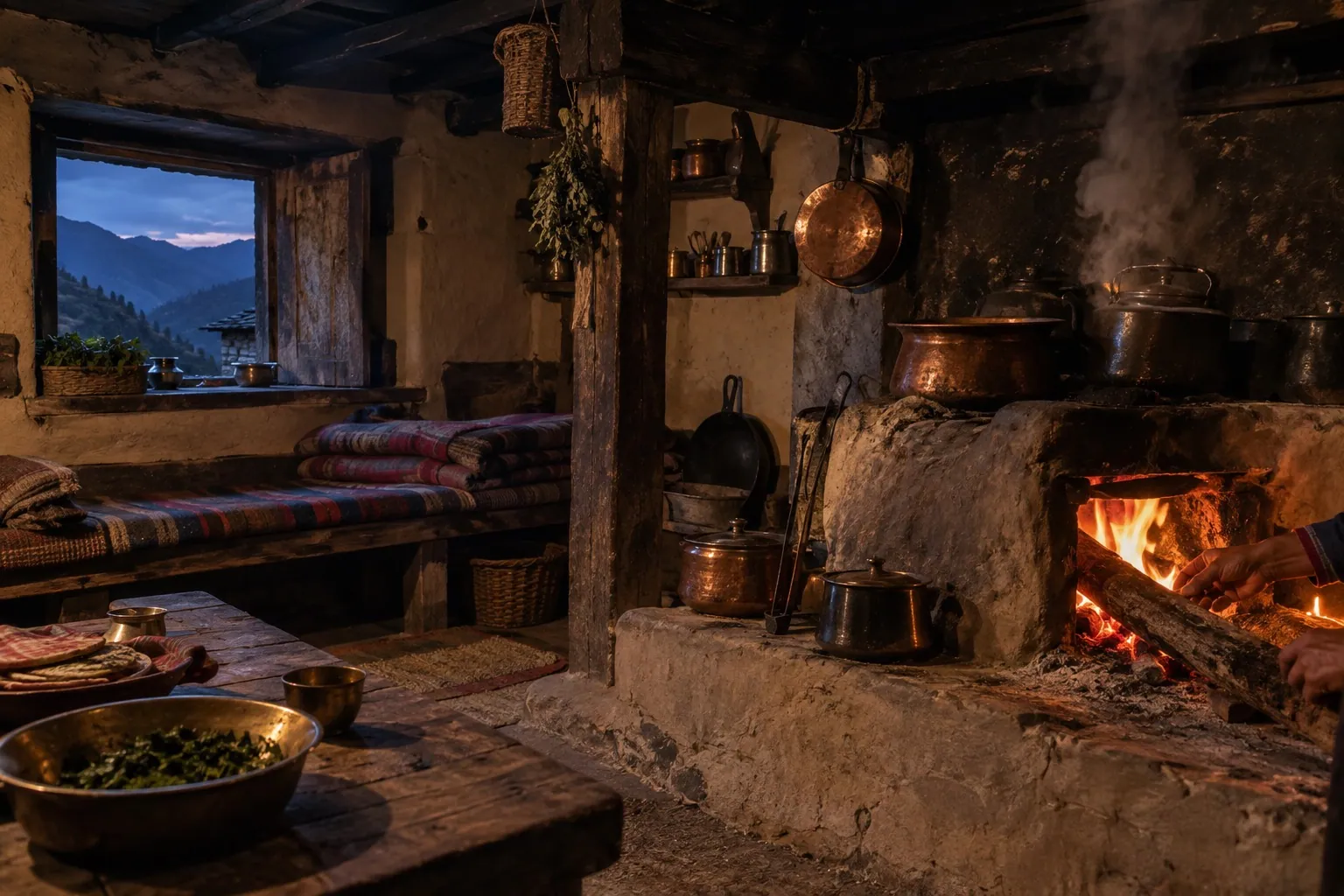
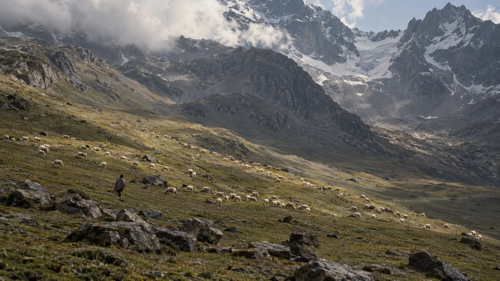
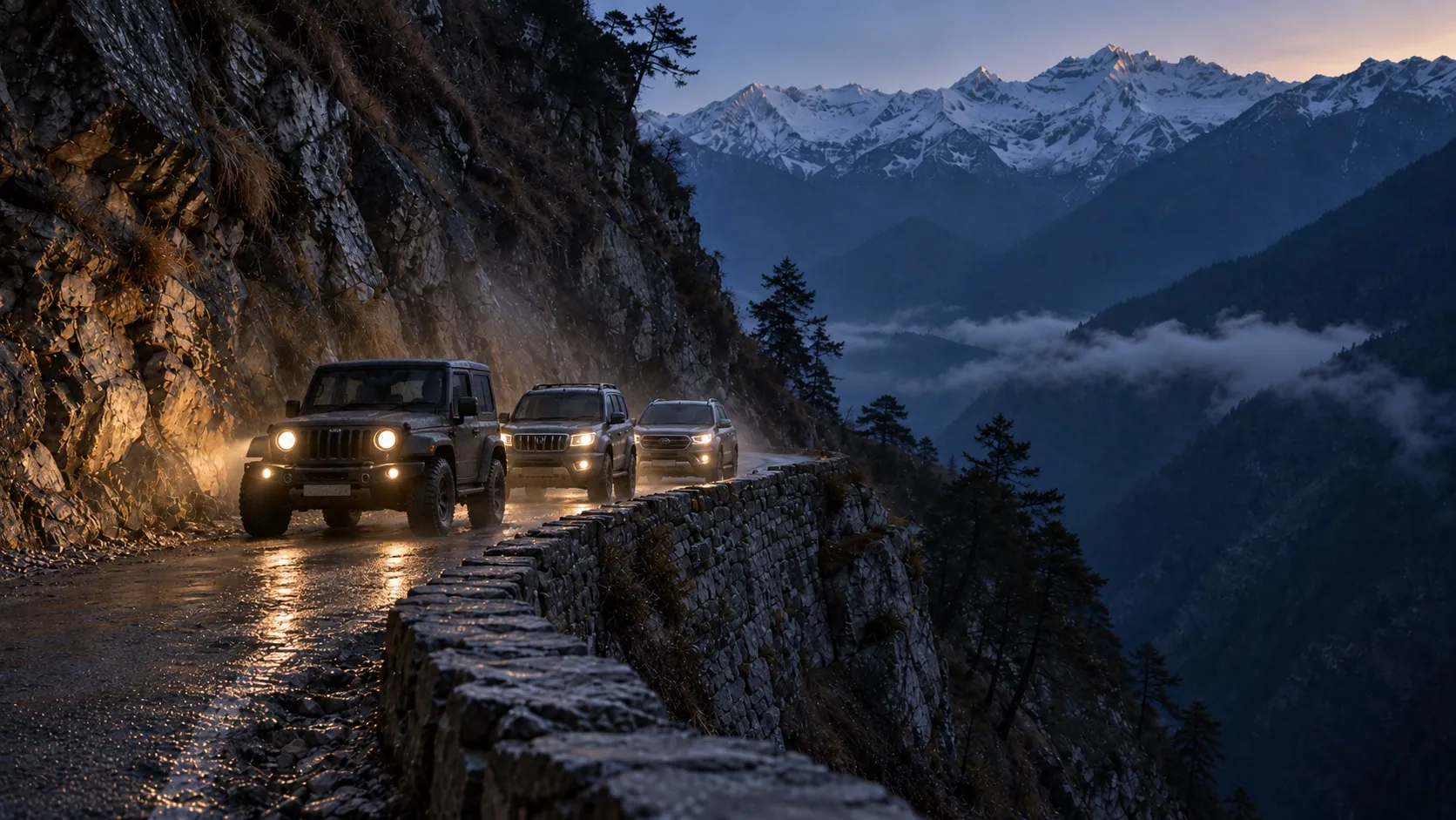
The bands the rest of adikailash.io will carry: stillness, the hearth, the weaver’s hands, the pastures, and the convoy at blue hour. Faces stay distant or unseen — generation never invents a person of a real community.
Take the real files.
Everything on this page comes from these. Do not screenshot, retrace or re-export — if you need a format that is not here, ask and it will be added.
- The markSVG · one path · 278 × 168Download
- The tileSVG · the mark on ink · favicon and app iconDownload
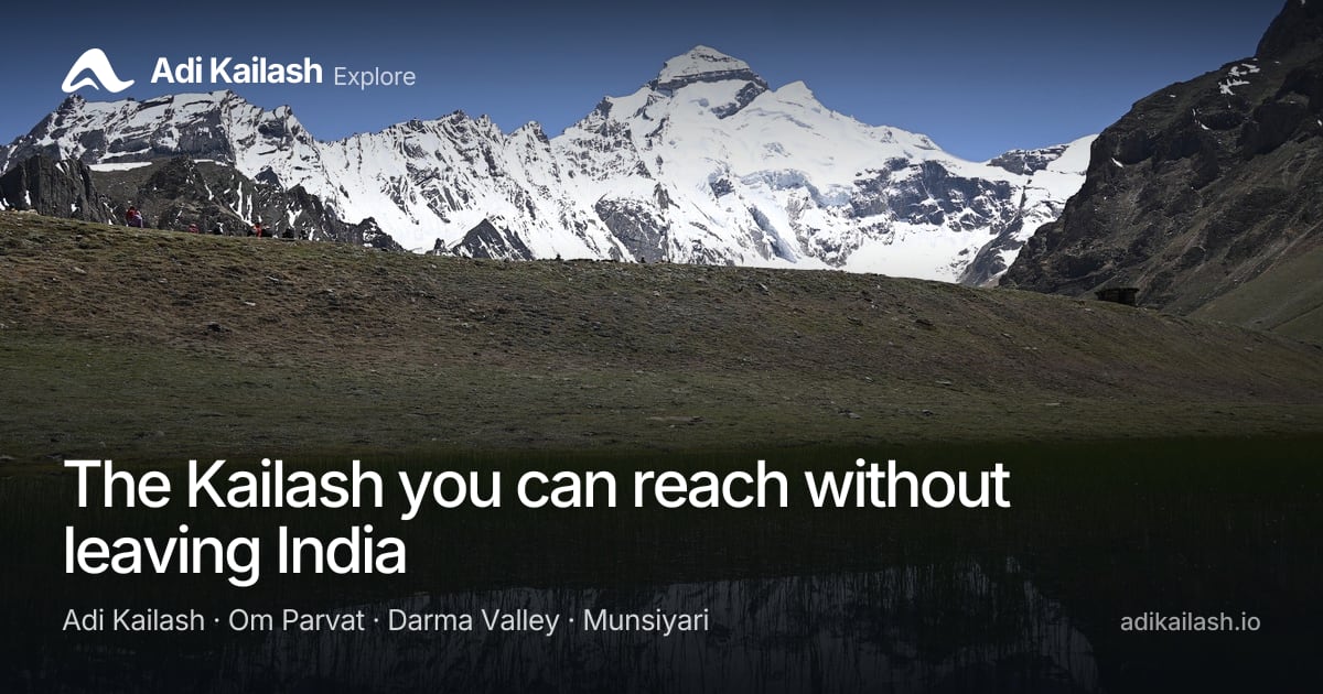
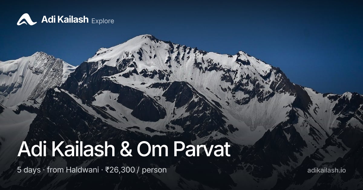
- Share card — homeJPEG · 1200 × 630Download
- Share card — Adi Kailash & Om ParvatJPEG · 1200 × 630 · one per tour page at /og/Download
- The image promptsTXT · the full generation pack, every slot on this pageDownload
- TypeSatoshi (Indian Type Foundry, free licence) · Inter Display (Rasmus Andersson, SIL OFL)

Press and partners
For photographs cleared for publication, founder biographies, or a lockup with your mark already set, write to us. We reply the way we reply to travellers: quickly, and with the real file.